---
date: "2026-08-19"
date-modified: "last-modified"
title: "Lab 1. Ecological Data"
format:
html:
anchor-sections: true
date-format: long
date-modified: last-modified
date-modified-title: "Last updated"
number-sections: false
page-layout: article
params:
hide_answers: false
---
::: callout-note
## BCB743
**This material must be reviewed by BCB743 students in Week 1 of Quantitative Ecology.**
:::
::: callout-tip
## This Lab Accompanies the Following Lecture
- [Lecture 3: Ecological Gradients](Lec-03-gradients.qmd)
- [Lecture 4: Biodiversity Concepts](Lec-04-biodiversity.qmd)
:::
::: callout-tip
## Data for This Lab
The Doubs River [@verneaux1973cours; @borcard2011numerical] and toy data
are at the links below:
- The environmental data -- [`DoubsEnv.csv`](../data/BCB743/DoubsEnv.csv)
- The species data -- [`DoubsSpe.csv`](../data/BCB743/DoubsSpe.csv)
- The spatial data -- [`DoubsSpa.csv`](../data/BCB743/DoubsSpa.csv)
- Example xyz data --
[`Euclidean_distance_demo_data_xyz.csv`](../data/BDC334/Euclidean_distance_demo_data_xyz.csv)
:::
Stuff
> *"A scientific man ought to have no wishes, no affections, -- a mere
> heart of stone."*
>
> --- Charles Darwin
## About Macroecology
**This module is about community ecology across different spatial and
temporal scales.** Community ecology underpins the vast fields of
biodiversity and biogeography and concerns spatial scales from square
meters to all of Earth. We can look at historical, contemporary, and
future processes implicated in shaping the distribution of life on our
planet.
Ecologists tend to analyse how multiple environmental factors act as
drivers that influence the distribution of tens or hundreds of species.
These data often are messy and statistical considerations need to be
understood within the context of the available data.
Up to 20 years ago, ecologists focused on populations (the dynamics of
individuals of one species interacting among each other and with their
environment) and communities (collections of multiple populations, how
they interact with each other and their environment, and how this
affects the structure and dynamics of ecosystems). This is a modern
development of ecology. But ecologists have expanded their horizon
regarding the questions they now seek answers for. Today,
**macroecology** offers a broadened view of ecology. Macroecologists
seek to find the geographical patterns and processes in biodiversity
across all spatial scales, from local to global, across time scales from
years to millennia, and across all taxonomic hierarchies (from genetic
variability within species up to major higher-level taxa, such as
families and orders). It attempts to arrive at a unifying theory for
ecology across all of these scales — e.g., one that can explain all
patterns in structure and functioning from microbes to blue whales.
Perhaps most importantly, it attempts to offer mechanistic explanations
for these patterns. At the heart of all ecological answers are also deep
insights stemming from understanding evolution (facilitated by the
growth of phylogenetic datasets — see below).
On a basic data analytical level, population ecology, community ecology,
and macroecology all share the same approach regarding the underlying
data. We start with data representing the species and the associated
environmental conditions at a selection of sites (called **species
tables** and **environmental tables**). The species tables are then
converted to **dissimilarity matrices** and the environmental tables to
**distance matrices**. From here, basic analyses can offer insights into
how biodiversity is structured, e.g., **species-abundance
distributions**, **occupancy-abundance curves**, **species-area
curves**, **distance decay curves**, and **gradient analyses** [as seen
in @shade2018macroecology]. In the Labs, we will explore some of these
properties.
## Ecological Data
### Properties of ecological datasets
Ecological data capture properties of the environment and properties of
communities. They are typically stored as separate datasets, but they
are analysed together.
These data sets are usually arranged in a **matrix**. In the case of
community composition, a matrix has **species (or higher level taxa
whose resolution depends on the research question) arranged down
columns** and **samples (typically the sites, stations, transects, time,
plots, etc.) along rows**. We call this a **sites × species table**. In
the case of environmental data, a matrix is a **site × environment
table**. The term 'sample' denotes the basic unit of observation.
Samples on a map may be quadrats, transects, stations, locations, traps,
seine net tows, trawls, grids cells, etc. You must be explicit about
the basic unit of the samples.
### The Doubs River data
An obvious example of environmental and species datasets is the Doubs
River dataset. Please refer to [David Zelený's website for an
explanation](https://www.davidzeleny.net/anadat-r/doku.php/en:data:doubs)
of these data. The primary publication outlining this study is
@verneaux1973cours, and an example analysis is provided by
@borcard2011numerical. These data demonstrate how one of the basic
mechanisms of biodiversity patterning — gradients — can be seen
operating in a real-world case study. It offers keen insight also into
the properties of species and environmental tables and the dissimilarity
and distance matrices derived from them.
### Looking at the files' content
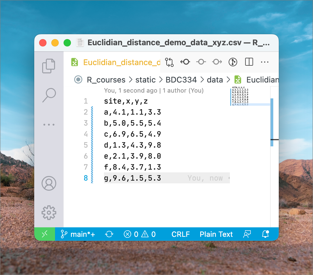
These data are available in CSV format, but we can open and view it in
MS Excel. 'CSV' means *comma separated value*. It is a plain text file
that can be edited in any text editor (such as Notepad on MS Windows, or
VS Code, VIM, emacs, etc. on all platforms). @fig-csv-file shows what a
CSV file looks like in a plain text editor, VS Code, on my computer.
Once imported, it will look similar to the one seen in @fig-doubs-env.
{#fig-csv-file}
::: callout-note
## Note About CSV Files and MS Excel
CSV is a standard format used in the scientific disciplines as it is
compatible with many software. Globally, scientists use a period '.' as
a decimal point separator. You can see this in the file above. Commas
are used exclusively as field separators (you'll see separate columns
once opened in MS Excel).
CSV files create a bit of a problem for South Africans, who are
indoctrinated from a young age to use commas as a decimal point
separators — this is to conform with the regional (South African)
expectation that dictates commas be used as decimals. So, when you
import a CSV file for the first time, you'll likely see gibberish
because your computer will probably be set up to honour the regional
(locale) the expectation of commas as decimal points (and 'R' for
currency, metric units of measurements, etc.). So, you need to know how
to fix this to prevent upsetting me (it is a pet peeve and frustrates me
endlessly) and yourselves.
Fixing this annoyance is not too tricky, as is demonstrated
[here](https://www.avantixlearning.ca/microsoft-excel/how-to-change-commas-to-decimal-points-and-vice-versa-in-excel/).
Follow the instruction under '**Changing commas to decimals and vice
versa by changing Excel Options**'. Better still, change the global
system settings, as the same article explains. Do this before importing
the CSV file.
:::
After importing the Doubs River data, we see something that resembles
the following two figures. First, in `DoubsSpe.csv`, we see the table
(or spreadsheet) view of the species data. The species codes for 27
species of fish appear as column headers (not all species' data are
visible as the data are truncated to the right) and in rows 2 through 31
(30 rows) are each of the samples — in this case, there is one sample
per site down the length of the river (@fig-doubs-spp).
{#fig-doubs-spp}
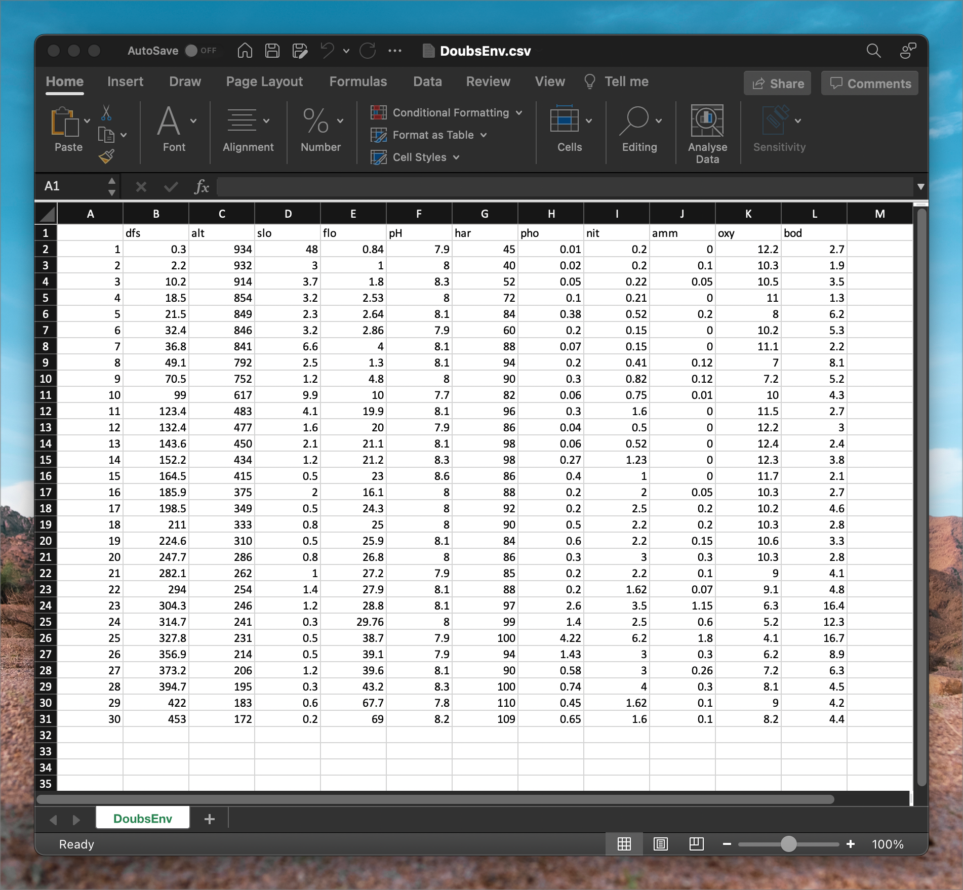
`DoubsEnv.csv` contains the environmental data, as seen in the following
figure. The names of the 11 environmental variables appear as column
headers, and there are 30 rows, one for each of the samples — the
samples match that of the species data (@fig-doubs-env).
{#fig-doubs-env}
Species data may be recorded as various kinds of measurements, such as
presence/absence data, biomass, frequency, or abundance.
'Presence/absence' of species simply tells us the species is there or is
not there. It is binary. 'Abundance' generally refers to the the number
of individuals per unit of area, volume. 'Per cent cover' refers to the
proportion of a covered by a species. Per cent cover is used for
vegetation, some encrusting species of animals (e.g., sponges), or
organisms such as oysters or mussels that can be too numerous to count
but whose abundance can be estimated as filling a portion of a sampling
unit such as a quadrat. 'Biomass' refers to the species' mass per unit
of area or volume. The type of measure will depend on the taxa and the
questions under consideration. The critical thing to note is that all
species have to be homogeneous in terms of the metric used to quantify
them (i.e., all of it as presence/absence, or abundance, or biomass, not
mixtures of them). The matrix's row vectors are the species composition
for the corresponding sample. That is to say, a row runs across multiple
columns, which tells us that the sample comprises all the species
whose names are given by the column titles. Note that in the case of the
data in the above figures, it is often the case that there are 0s,
meaning that not all species are present at all sites. Species
composition is frequently expressed in relative abundance, i.e.
constrained to a constant total such as 1 or 100%, or biomass, where the
upper limit might be arbitrary.
The environmental data may be heterogeneous, i.e. the units of measure
may differ among the variables. For example, pH has no units, the
concentration of some nutrients has a unit of (typically) μM, elevation
may be in meters, etc. Because these units have different magnitudes and
ranges, we may need to standardise them. To standardise data, we
subtract the mean of each column from each data point in the column and
then divide each of the resultant values by the standard deviation of
the columns. The calculation and its effect are explained in
@sec-standardisation.
::: callout-important
## Lab 1
(To be reviewed by BCB743 student but not for marks.)
Use the Doubs River environmental dataset to complete the following tasks:
**Total: 30 marks for BDC334 students.**
- **1.a) (/ 1)** Calculate the mean and SD for each variable (column) of
the "raw" data. Explain.
- **Mark allocation:** 1 mark only for the full, correct suite of means
and sample SDs.
- **1.b) (/ 1)** Standardise the Doubs River environmental data in MS
Excel.
- **Mark allocation:** 1 mark only for the full, correctly
standardised environmental dataset.
- **1.c) (/ 1)** Calculate the mean and SD for each standardised variable
(column). Explain.
- **Mark allocation:** 1 mark only for the full, correct suite of
standardised means and sample SDs, with a correct explanation.
:::
`r if (params$hide_answers) "::: {.content-hidden}"`
::: {.callout-tip appearance="simple"}
## Model answers: Task 1
### 1.a Raw-data summaries
**Marking: 1 mark only for the complete, correct table.**
The values below use the sample standard deviation, as calculated by
`STDEV.S` in Excel. The site-number column is an identifier and is not
included.
| Variable | Mean | Sample SD |
|---|---:|---:|
| Distance from source (`dfs`) | 188.233 | 139.243 |
| Altitude (`alt`) | 481.567 | 271.351 |
| Slope (`slo`) | 3.497 | 8.656 |
| Flow (`flo`) | 22.201 | 18.102 |
| pH (`pH`) | 8.050 | 0.174 |
| Hardness (`har`) | 86.100 | 16.865 |
| Phosphate (`pho`) | 0.558 | 0.876 |
| Nitrate (`nit`) | 1.654 | 1.413 |
| Ammonium (`amm`) | 0.209 | 0.379 |
| Oxygen (`oxy`) | 9.390 | 2.215 |
| Biological oxygen demand (`bod`) | 5.117 | 3.864 |
The means describe the centre of each variable across the 30 sites. The
SDs describe variation among sites, but they cannot be compared directly
across variables because the variables have different units and scales.
### 1.b Standardisation
**Marking: 1 mark only for the complete, correctly standardised
dataset.**
For the first environmental variable in cell B2, the Excel formula is:
```{.excel}
=(B2-AVERAGE(B$2:B$31))/STDEV.S(B$2:B$31)
```
Copy the formula down to row 31 and then across all environmental-variable
columns. Do not standardise the site-number column. The complete result,
rounded to three decimal places, is:
| Site | `dfs` | `alt` | `slo` | `flo` | `pH` | `har` | `pho` | `nit` | `amm` | `oxy` | `bod` |
|---:|---:|---:|---:|---:|---:|---:|---:|---:|---:|---:|---:|
| 1 | -1.350 | 1.667 | 5.141 | -1.180 | -0.864 | -2.437 | -0.625 | -1.029 | -0.552 | 1.269 | -0.625 |
| 2 | -1.336 | 1.660 | -0.057 | -1.171 | -0.288 | -2.733 | -0.613 | -1.029 | -0.288 | 0.411 | -0.832 |
| 3 | -1.279 | 1.594 | 0.023 | -1.127 | 1.439 | -2.022 | -0.579 | -1.015 | -0.420 | 0.501 | -0.418 |
| 4 | -1.219 | 1.373 | -0.034 | -1.087 | -0.288 | -0.836 | -0.522 | -1.022 | -0.552 | 0.727 | -0.988 |
| 5 | -1.197 | 1.354 | -0.138 | -1.081 | 0.288 | -0.125 | -0.203 | -0.802 | -0.025 | -0.628 | 0.280 |
| 6 | -1.119 | 1.343 | -0.034 | -1.068 | -0.864 | -1.548 | -0.408 | -1.064 | -0.552 | 0.366 | 0.047 |
| 7 | -1.088 | 1.325 | 0.358 | -1.005 | 0.288 | 0.113 | -0.556 | -1.064 | -0.552 | 0.772 | -0.755 |
| 8 | -0.999 | 1.144 | -0.115 | -1.155 | 0.288 | 0.468 | -0.408 | -0.880 | -0.236 | -1.079 | 0.772 |
| 9 | -0.846 | 0.997 | -0.265 | -0.961 | -0.288 | 0.231 | -0.294 | -0.590 | -0.236 | -0.989 | 0.022 |
| 10 | -0.641 | 0.499 | 0.740 | -0.674 | -2.015 | -0.243 | -0.568 | -0.640 | -0.526 | 0.275 | -0.211 |
| 11 | -0.466 | 0.005 | 0.070 | -0.127 | 0.288 | 0.587 | -0.294 | -0.038 | -0.552 | 0.953 | -0.625 |
| 12 | -0.401 | -0.017 | -0.219 | -0.122 | -0.864 | -0.006 | -0.591 | -0.816 | -0.552 | 1.269 | -0.548 |
| 13 | -0.321 | -0.116 | -0.161 | -0.061 | 0.288 | 0.706 | -0.568 | -0.802 | -0.552 | 1.359 | -0.703 |
| 14 | -0.259 | -0.175 | -0.265 | -0.055 | 1.439 | 0.706 | -0.328 | -0.300 | -0.552 | 1.314 | -0.341 |
| 15 | -0.170 | -0.245 | -0.346 | 0.044 | 3.166 | -0.006 | -0.180 | -0.463 | -0.552 | 1.043 | -0.781 |
| 16 | -0.017 | -0.393 | -0.173 | -0.337 | -0.288 | 0.113 | -0.408 | 0.245 | -0.420 | 0.411 | -0.625 |
| 17 | 0.074 | -0.489 | -0.346 | 0.116 | -0.288 | 0.350 | -0.408 | 0.599 | -0.025 | 0.366 | -0.134 |
| 18 | 0.164 | -0.548 | -0.312 | 0.155 | -0.288 | 0.231 | -0.066 | 0.386 | -0.025 | 0.411 | -0.600 |
| 19 | 0.261 | -0.632 | -0.346 | 0.204 | 0.288 | -0.125 | 0.048 | 0.386 | -0.157 | 0.546 | -0.470 |
| 20 | 0.427 | -0.721 | -0.312 | 0.254 | -0.288 | -0.006 | -0.294 | 0.952 | 0.239 | 0.411 | -0.600 |
| 21 | 0.674 | -0.809 | -0.288 | 0.276 | -0.864 | -0.065 | -0.408 | 0.386 | -0.288 | -0.176 | -0.263 |
| 22 | 0.760 | -0.839 | -0.242 | 0.315 | 0.288 | 0.113 | -0.408 | -0.024 | -0.368 | -0.131 | -0.082 |
| 23 | 0.834 | -0.868 | -0.265 | 0.365 | 0.288 | 0.646 | 2.330 | 1.306 | 2.482 | -1.395 | 2.920 |
| 24 | 0.908 | -0.887 | -0.369 | 0.418 | -0.288 | 0.765 | 0.961 | 0.599 | 1.031 | -1.892 | 1.859 |
| 25 | 1.002 | -0.923 | -0.346 | 0.911 | -0.864 | 0.824 | 4.179 | 3.216 | 4.196 | -2.388 | 2.998 |
| 26 | 1.211 | -0.986 | -0.346 | 0.934 | -0.864 | 0.468 | 0.995 | 0.952 | 0.239 | -1.440 | 0.979 |
| 27 | 1.328 | -1.016 | -0.265 | 0.961 | 0.288 | 0.231 | 0.025 | 0.952 | 0.134 | -0.989 | 0.306 |
| 28 | 1.483 | -1.056 | -0.369 | 1.160 | 1.439 | 0.824 | 0.208 | 1.660 | 0.239 | -0.582 | -0.160 |
| 29 | 1.679 | -1.100 | -0.335 | 2.513 | -1.439 | 1.417 | -0.123 | -0.024 | -0.288 | -0.176 | -0.237 |
| 30 | 1.901 | -1.141 | -0.381 | 2.585 | 0.864 | 1.358 | 0.105 | -0.038 | -0.288 | -0.537 | -0.185 |
### 1.c Standardised-data summaries
**Marking: 1 mark only for the complete, correct result and
explanation.**
For every correctly standardised environmental variable, the mean is 0
apart from numerical rounding and the sample SD is 1. Thus, for all 11
variables (`dfs`, `alt`, `slo`, `flo`, `pH`, `har`, `pho`, `nit`, `amm`,
`oxy` and `bod`), the summary is **mean = 0; sample SD = 1**.
Standardisation
centres every variable on zero and puts the variables on a common scale.
It does not change their ordering or distributional shape, and it does
not make skewed data normally distributed.
:::
`r if (params$hide_answers) ":::"`
### Properties of species datasets
Many community data matrices share some general characteristics:
- Most species occur only infrequently. The majority of species might
typically be represented at only a **few locations** (where they
might be pretty abundant). Or some species are simply **rare** in
the sampled region (i.e. when they are present, they are present at
a very low abundance). This results in **sparse matrices** where the
bulk of the entries consists of zeros.
- Ecologists tend to sample a multitude of factors that they think
influence species composition, so the matching environmental data
set will also have multiple (10s) columns that will be assessed in
various hypotheses about the drivers of species patterning across
the landscape. For example, fynbos biomass may be influenced by the
fire regime, elevation, aspect, soil moisture, soil chemistry,
edaphic features, etc. These datasets are called
**multi-dimensional** matrices, with the 'dimensions' referring to
the many species or environmental variables.
- Even though we may capture a multitude of information about many
environmental factors, **the number of important ones is generally
relatively low** — i.e. a few factors can explain the majority of
the explainable variation, and it is our intention to find out which
of them is most important.
- Much of the signal may be spurious, i.e. the matrices have **high
noise**. Variability is a general characteristic of the data, which
may result in emerging false patterns. This is because sampling may
capture a considerable amount of stochasticity that may mask the
actual pattern of interest. Imaginative and creative sampling may
reveal some of the ecological patterns we are after, but this
requires long years of experience and is not something that can
easily be taught as part of our module.
- There is a significant amount of **collinearity**. This means that
many correlated explanatory variables can explain patterning, but
only a few act in a way that implies causation. Collinearity is
something we will return to later on.
## Ecological Gradients {#sec-gradients}
Although there are many ways in which species can respond to their
environment, one of the most striking responses can be seen along with
environmental gradients. Next, we will explore this concept by
discussing coenoclines and unimodal species distribution models.
### The unimodal model
The **unimodal** model is an idealised species response curve
(visualised as a coenocline) where a species has only one mode of
abundance. In this species response curve, the species has one optimal
environmental condition where it is most abundant (the fewest
ecophysiological and ecological stressors). If any aspect of the
environment is suboptimal (greater or lesser than the optimum), the
species will perform more poorly and have a lower abundance. The
unimodal model offers a convenient heuristic tool for understanding how
species can become structured along environmental gradients.
### Coenoclines, coenoplanes, and coenospaces
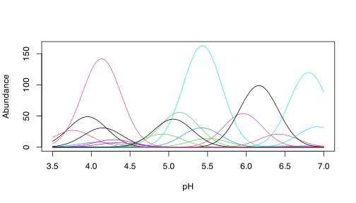
A **coenocline** is a graphical display of *all species* response curves
(see definition below) *simultaneously* along one environmental
gradient. This is a useful way to display the arrangement of species'
[*fundamental niches*](Lec-03-gradients.qmd#sec-niches) along gradients.
It aids our understanding of the species response curve if we imagine
the gradient operating in only one geographical direction. The
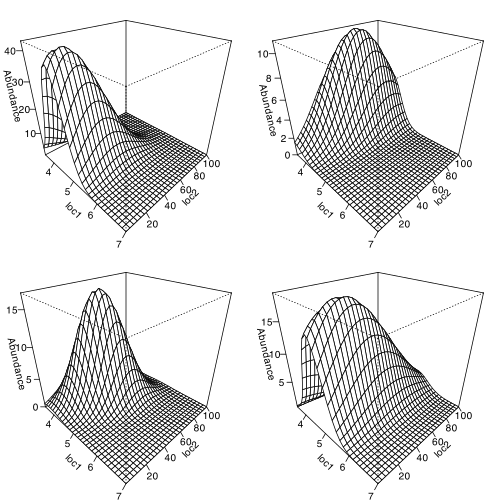
**coenoplane** concept extends the coenocline to cover two gradients.
Again, our visual representation can be facilitated if the two gradients
are visualised orthogonal (in this case, at right angles) to each other
(e.g., east-west and north-south) and do not interact. A **coenospace**
complicates the model substantially, as it can allow for an unspecified
number of gradients to operate simultaneously on multiple species
simultaneously. It will probably also capture interactions of
environmental drivers on the species.
```{r fig-coenocline}
#| fig-cap: "A coenocline."
#| warning: false
#| dpi: 300
#| fig-width: 7
#| fig-height: 4
#| code-fold: true
#| code-summary: "Show the code"
library(coenocliner)
set.seed(2)
M <- 20 # number of species
ming <- 3.5 # gradient minimum...
maxg <- 7 # ...and maximum
locs <- seq(ming, maxg, length = 100) # gradient locations
opt <- runif(M, min = ming, max = maxg) # species optima
tol <- rep(0.25, M) # species tolerances
h <- ceiling(rlnorm(M, meanlog = 3)) # max abundances
pars <- cbind(opt = opt, tol = tol, h = h) # put in a matrix

mu <- coenocline(locs,
    responseModel = "gaussian", params = pars,
    expectation = TRUE
)

matplot(locs, mu, lty = "solid", type = "l", xlab = "pH", ylab = "Abundance")
```
Above is an example of a coenocline using simulated species data. It
demonstrates an important idea: that of unimodal species distributions
(@fig-coenocline).
```{r fig-coenoplane-smooth}
#| fig-cap: "A smoothed coenoplane."
#| dpi: 300
#| fig-width: 7
#| fig-height: 7
#| code-fold: true
#| code-summary: "Show the code"
set.seed(10)
N <- 30 # number of samples
M <- 20 # number of species
## First gradient
ming1 <- 3.5 # 1st gradient minimum...
maxg1 <- 7 # ...and maximum
loc1 <- seq(ming1, maxg1, length = N) # 1st gradient locations
opt1 <- runif(M, min = ming1, max = maxg1) # species optima
tol1 <- rep(0.5, M) # species tolerances
h <- ceiling(rlnorm(M, meanlog = 3)) # max abundances
par1 <- cbind(opt = opt1, tol = tol1, h = h) # put in a matrix
## Second gradient
ming2 <- 1 # 2nd gradient minimum...
maxg2 <- 100 # ...and maximum
loc2 <- seq(ming2, maxg2, length = N) # 2nd gradient locations
opt2 <- runif(M, min = ming2, max = maxg2) # species optima
tol2 <- ceiling(runif(M, min = 5, max = 50)) # species tolerances
par2 <- cbind(opt = opt2, tol = tol2) # put in a matrix
## Last steps...
pars <- list(px = par1, py = par2) # put parameters into a list
locs <- expand.grid(x = loc1, y = loc2) # put gradient locations together

mu2d <- coenocline(locs,
    responseModel = "gaussian",
    params = pars, extraParams = list(corr = 0.5),
    expectation = TRUE
)

layout(matrix(1:4, ncol = 2))
op <- par(mar = rep(1, 4))
for (i in c(2, 8, 13, 19)) {
    persp(loc1, loc2, matrix(mu2d[, i], ncol = length(loc2)),
        ticktype = "detailed", zlab = "Abundance",
        theta = 45, phi = 30
    )
}
```
```{r code-par-op}
#| echo: false
#| code-fold: true
#| code-summary: "Show the code"
par(op)
layout(1)
```
```{r fig-coenoplane-raw}
#| fig-cap: "A 'raw' coenoplane."
#| dpi: 300
#| fig-width: 7
#| fig-height: 7
#| code-fold: true
#| code-summary: "Show the code"
sim2d <- coenocline(locs,
    responseModel = "gaussian",
    params = pars, extraParams = list(corr = 0.5),
    countModel = "negbin", countParams = list(alpha = 1)
)

layout(matrix(1:4, ncol = 2))
op <- par(mar = rep(1, 4))
for (i in c(2, 8, 13, 19)) {
    persp(loc1, loc2, matrix(sim2d[, i], ncol = length(loc2)),
        ticktype = "detailed", zlab = "Abundance",
        theta = 45, phi = 30
    )
}
```
```{r code-par-op-2}
#| echo: false
#| code-fold: true
#| code-summary: "Show the code"
par(op)
layout(1)
```
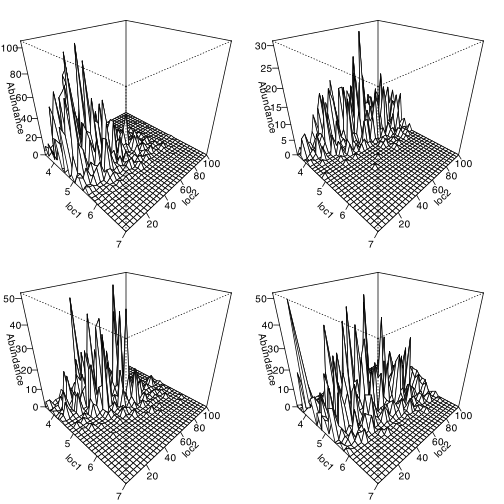
A coenoplane is demonstrated above (@fig-coenoplane-smooth). We see
idealised surfaces (smooth models), and the 'raw' species counts are
obscured. Plotting the actual count data looks messier
(@fig-coenoplane-raw) because the measured data are not only a
reflection of the underlying species response according to the unimodal
model (and hence the fundamental niche), but also of the biotic
processes that result in the realised niche, and the stochastic
processes that generate some 'noise' seen in the data.
#### Species response curves
Plotting the abundance of a species as a function of position along a
the gradient is called a **species response curve**. If a long enough
the gradient is sampled, a species typically has a *unimodal* response
(one peak *resembling* a Gaussian distribution) to the gradient.
Although the idealised Gaussian response is desired (for statistical
purposes, largely), in nature, the curve might deviate quite noticeably
from what's considered ideal. It is probable that a perfectly normal
species distribution along a gradient can only be expected when the
gradient is perfectly linear in magnitude (seldom true in nature),
operates along only one geographical direction (unlikely), and all other
potentially additive environmental influences are constant across the
ecological (coeno-) space (also not a realistic expectation). Very
importantly, also, the species response curve is not a direct measure of
the species' fundamental niche, but rather a reflection of the species'
realised niche.
## Exploring the Data
At the start of the analysis, before we go deeper into the patterns in
the data, we need to explore the data and compute the various synthetic
descriptors. This might involve calculating means and standard
deviations for some of the variables we feel are most important. So, we
say that we produce univariate summaries, and if there is a need we may
also create some graphical summaries like line plots or frequency
histograms. Be guided by the research questions as to what is required.
Typically, I don't like to produce too many detailed inferential
statistics of the multivariate data considered one variable at a time
(there are special statistical techniques available that allow us to do
so more efficiently and effectively, but we will get to it in the
Honours Module [Quantitative Ecology](../BCB743/BCB743_index.qmd)), choosing instead
to see which relationships and patterns emerge from the exploratory
summary plots before testing their statistical significance using
multivariate approaches. But that is me. Sometimes, some hypotheses
call for a few univariate inferential analyses (again, this is the
topic of an Honours module on [Biostatistics](../BCB744/basic_stats/index.qmd)).
::: callout-important
## Lab 1 (Continue)
(To be reviewed by BCB743 student but not for marks)
2. **(/ 2)** Create an $x-y$ plot of the geographical coordinates in
`DoubsSpa.csv`.
- **Mark allocation:** 1 mark for plotting all coordinates correctly
on labelled axes; 1 mark for identifying or joining the sites in
the correct site-number order.
3. **(/ 6)** Using some graphs that plot the trends of the Doubs River
environmental variables along the length of the river, describe the
patterns in some of the environmental variables and offer
explanations for how they might be responsible for affecting species
distributions down the length of the Doubs River. Which three
variables do you think will be able to explain the trends in the
species data?
- **Mark allocation:** 6 marks for three correct environmental trends
(2 marks per graph, 1 mark per graph if not fully complete). The
graphs prepared here are assessed under Question 4. No marks for
text feedback.
:::
`r if (params$hide_answers) "::: {.content-hidden}"`
::: {.callout-tip appearance="simple"}
## Model answers: Tasks 2 and 3
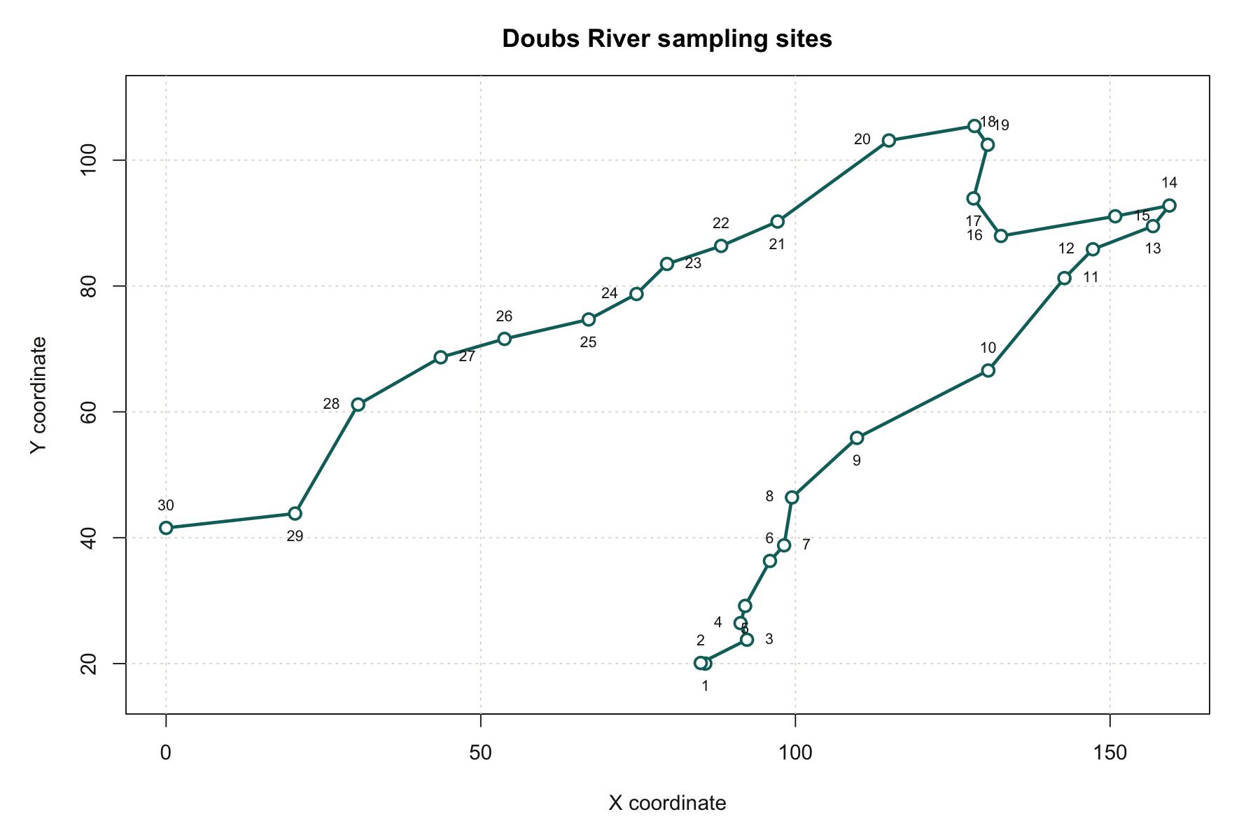
### 2. Spatial plot
**Marking: 1 mark for all points on labelled axes; 1 mark for the
correct site sequence.**
{#fig-lab1-answer-spatial}
The sites form a curved river course rather than a straight line. From
Site 1, near $(85.7, 20.0)$, the sequence runs generally north-east to
Site 14, near $(159.4, 92.8)$. It then turns west and south-west, ending
at Site 30 near $(0.0, 41.6)$. The points must be joined in site-number
order; sorting by either coordinate would incorrectly reconstruct the
river course.
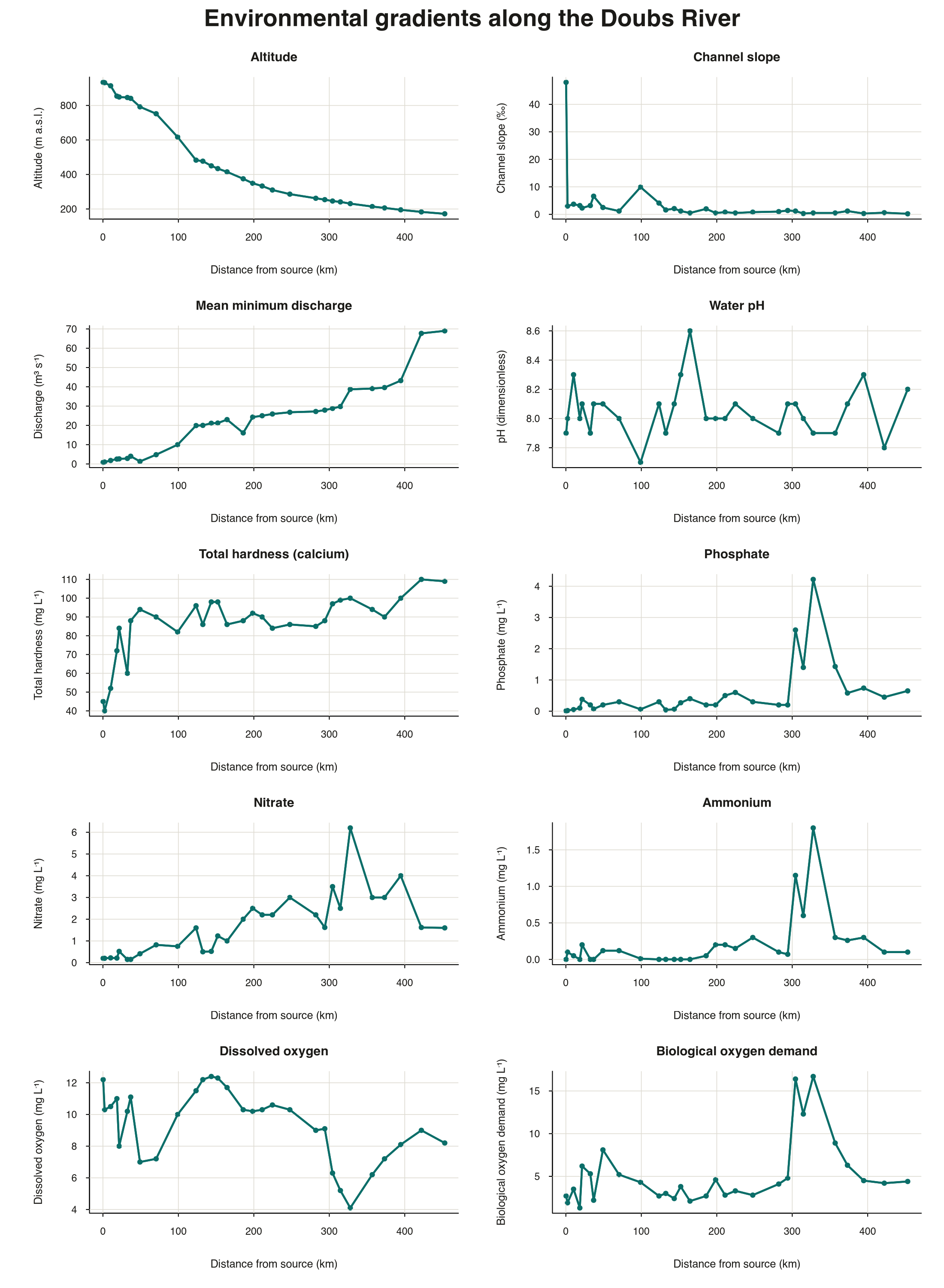
### 3. Environmental trends and likely drivers
**Marking: Three graphs required; 2 marks per graph, 1 mark per graph if not fully complete.**
{#fig-lab1-answer-environmental-trends}
The clearest longitudinal patterns are:
- Distance from the source increases by definition, while altitude
declines strongly from 934 to 172. These two variables are strongly
negatively related and describe the upstream-to-downstream gradient.
- Flow generally increases from 0.84 to 69.0, although local departures
occur. Hardness also tends to increase downstream.
- Slope is greatest at Site 1 and is generally low downstream, apart
from local increases such as Site 10.
- Phosphate, nitrate, ammonium and biological oxygen demand increase
sharply around Sites 23--25. Their coincident peaks indicate a local
nutrient and organic-pollution pulse rather than a smooth downstream
trend.
- Oxygen generally declines downstream and reaches its minimum at Site
25, where biological oxygen demand and nutrient concentrations are
high. Oxygen then recovers at later sites.
- pH varies comparatively little, so it is unlikely to explain much of
the large-scale turnover by itself.
A defensible set of three predictors is **flow**, **phosphate** and
**oxygen**. Flow represents changing physical habitat, phosphate marks
the nutrient-pollution pulse, and oxygen represents a direct
physiological constraint. Other sets can be correct if they are
ecologically justified, but strongly correlated variables such as
distance from source, altitude and flow should not be treated as three
independent mechanisms. The sharp fall in fish richness at Sites 23--25,
followed by recovery downstream, is consistent with the local
water-quality disturbance.
:::
`r if (params$hide_answers) ":::"`
## Pairwise Matrices
Although we typically start our forays into data exploration using sites
× species and sites × environment tables, the formal statistical
analyses usually require **pairwise association matrices**. Such matrices
are symmetrical (sometimes only the lower or upper triangle is
displayed) square matrices (i.e. $n \times n$). These matrices tell us
how related any sample is to any other sample in our pool of samples
(i.e., relatedness among rows with respect to whatever populates the
columns, be they species information of environmental information).
Let us consider various kinds of association matrices under the headings
**Distances**, **Correlations**, **Associations**, **Similarities**, and
**Dissimilarities**.
### Distances
A frequently used distance metric in ecological and geographical studies
is Euclidean distance. Euclidean distance represents the 'ordinary
straight-line' distance between two points in Euclidean space. When
working with geographical coordinates over small areas of Earth's
surface, Euclidean distance is very similar (i.e., almost directly
proportional) to the actual geographical distance, making the concept
intuitive to understand.
In its simplest form, Euclidean distance is calculated in a planar
Cartesian area, which is familiar as a graph with $x$- and $y$-axes. In
2D and 3D space, it gives distances in Cartesian units between points on
a plane ($x$, $y$) or in volume ($x$, $y$, $z$). There is a linear
relationship between the units in the physical realm and the units in
Euclidean space, implying that short distances between pairs of points
on a map or graph also represent short geographic distances on Earth.
Euclidean distance is calculated using the Pythagorean theorem and is
typically applied to standardised environmental data (not species data):
$$
d(a,b) = \sqrt{\sum_{i=1}^{n} (a_i - b_i)^2}
$$
In this formula:
- $a$ and $b$ are two points in Euclidean space; in terms of
environmental data, $a$ and $b$ represent two sites.
- Each element $i = 1$ through $n$ in the vectors $a$ and $b$
represents a dimension or variable in the space. For example, if we
have three environmental variables, $n = 3$, and the formula
calculates the Euclidean distance between the two sites in a
three-dimensional space.
- The summation $\sum_{i=1}^{n}$ goes over all dimensions from 1 to
$n$.
Each coordinate or variable could represent different environmental
factors such as temperature, depth, or light intensity (sometimes also
called 'dimensions' of environmental space). For example, in the case of
three environmental variables, the Euclidean distance would be
calculated as:
$$
d(a,b) = \sqrt{(a_{\text{temp}} - b_{\text{temp}})^2 + (a_{\text{depth}} - b_{\text{depth}})^2 + (a_{\text{light}} - b_{\text{light}})^2}
$$
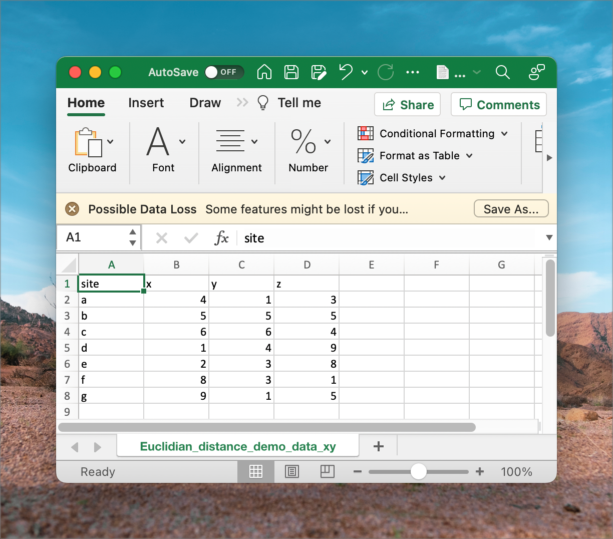
In the example dataset downloaded earlier
(`Euclidean_distance_demo_data_xyz.csv`), we can calculate the distance
between every pair of sites named ***a*** to ***g***. The 'raw' data
representing $x$, $y$ and $z$ dimensions can be viewed in MS Excel, as
we see in @fig-data-xyz.
{#fig-data-xyz}
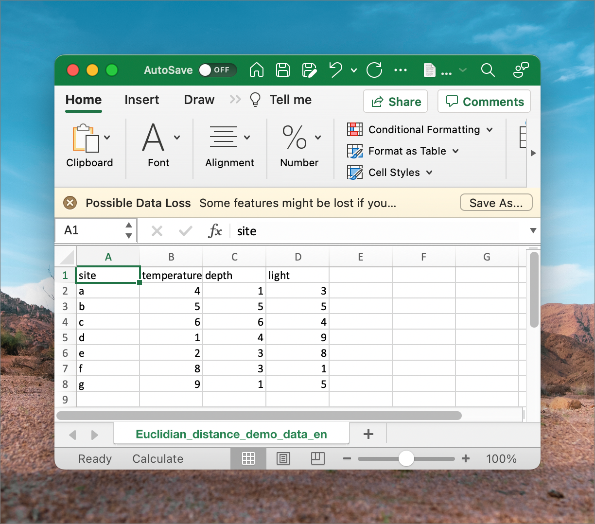
We can substitute $x$, $y$ and $z$ for environmental 'dimensions,' and
we have a set of data that resembles what we see in @fig-data-env.
Regardless of whether we have $x$, $y$ and $z$ or environmental
dimensions, the application of the Pythagorean Theorem is the same.
{#fig-data-env}
@fig-euclidian-env shows how we may calculate Euclidean distance in MS Excel using some built-in functions. The function `SUMXMY2` calculates the sum of the differences of squares between two corresponding arrays. It squares each value in array `x`, squares the corresponding value in array `y`, subtracts the `y`-square from the `x`-square, and then sums all these differences. That value is then subjected to a square-root calculation using `SQRT`.
To produce the pairwise matrix, you'd have to do this for every pair of sites. As a minimum, calculate the bottom left triangle. For completeness, calculate the diagonal, which will be all zeros in this (and every!) instance. It is a tedious process, I know!
{#fig-euclidian-env
width="1224"}
### Standardisation {#sec-standardisation}
Standardise each environmental variable separately before calculating
Euclidean distances. For site $i$ and environmental variable $j$, the
standardised value (or *z*-score) is
$$
z_{ij} = \frac{x_{ij} - \bar{x}_{j}}{s_{j}},
$$
where $x_{ij}$ is the observed value, $\bar{x}_{j}$ is the mean of
variable $j$, and $s_{j}$ is its sample standard deviation.
Standardisation removes the original units and gives each environmental
variable a mean of approximately 0 and a standard deviation of 1. It
therefore reduces the chance that a variable dominates a Euclidean
distance simply because it was measured in larger units or has a wider
range. It does not make a skewed variable normally distributed.
In `DoubsEnv.csv`, the site number is in column A and the first
environmental variable is in cells B2:B31. Enter the following formula
in a new cell for the first value:
```{.excel}
=(B2-AVERAGE(B$2:B$31))/STDEV.S(B$2:B$31)
```
Copy the formula down to standardise the rest of that variable, then
copy it across for the other environmental-variable columns. Do not
standardise the site-number column. Check your result by confirming that
the mean of each standardised column is approximately 0 and its sample
standard deviation is 1.
### Correlations
Correlations ask whether two sets of variables, or rather, a pair of variables, exhibit any kind of relationship between them. For example, do we expect that as temperature increases, so too does humidity? In situations where an increase in temperature is associated with an increase in humidity, that is, both variables increase together, we would say that these samples are positively correlated.
Conversely, when discussing a negative correlation, we find that as one variable increases in magnitude, the variable we have paired with it demonstrates a corresponding decrease in its magnitude. In other words, there is an inverse relationship between those two variables.
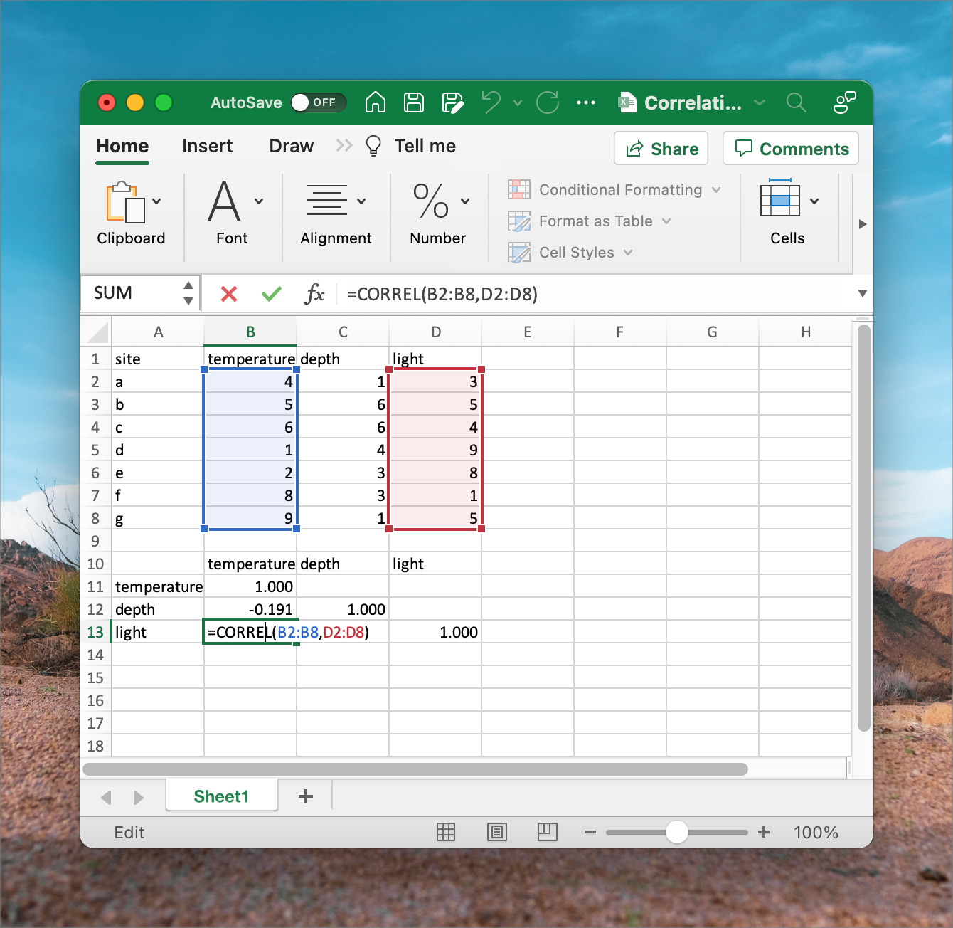
So, we use correlations to establish how environmental variables relate
across the sample sites. Therefore, a correlation performed to a sites ×
variable table is done between columns (variables), not rows, as in the
Euclidean distance calculation, which compares the rows (sites). We do
not need to standardise as one would for calculating Euclidean distances
(but it will do no harm if you do). Correlation coefficients (so-called
$r$-values) vary in magnitude from -1 (a perfect inverse relationship)
from 0 (no relationship) to 1 (a perfect positive linear relationship).
{#fig-correlation-env}
The resultant pairwise correlation matrix shows the names of the
environmental variables as both column and row names. Contrast this with
what is presented as row and column names in the distance matrix
(@fig-correlation-env).
### Associations, similarities, and dissimilarities
Thus far, we have worked with environmental data. Associations,
similarities, and dissimilarities extend the pairwise matrix to species
data. We will discuss and calculate these matrices in Lab 3.
That's it for this week, Folks! I'll leave you with some lovely
exercises to take you through the rest of the week.
## Summary of Species and Environmental Data
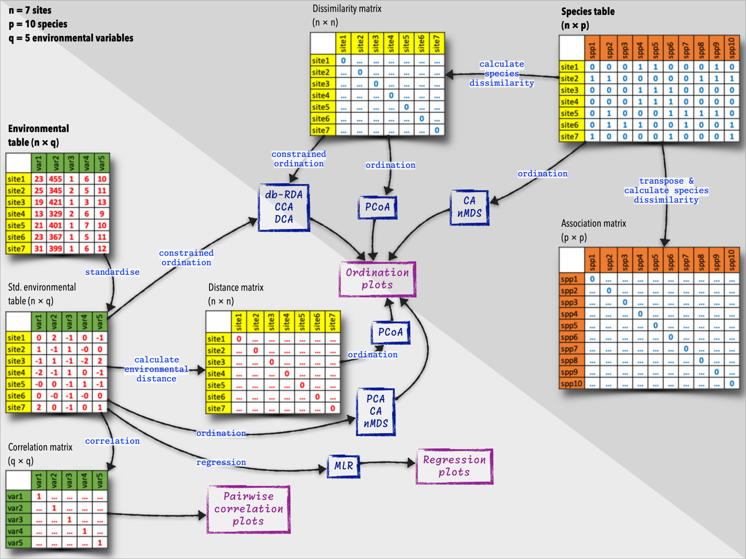
The diagram below (@fig-data-tables) summarises the species and
environmental data tables, and what we can do with them. These tables
are the starting points of many additional analyses, and we will explore
some of these ecological relationships later in this module.
{#fig-data-tables}
::: callout-important
## Lab 1 (Continue)
(To be reviewed by BCB743 student but not for marks)
4. **(/ 5)** Using the Doubs River environmental data, calculate the lower left
triangle (including the diagonal) distance matrix for *every pair*
of sites in Sites 1, 3, 5, ..., 29 (i.e. using only every second
site). Explain any patterns or trends in this resultant distance
matrix regarding how similar/different sites are relative to each
other. Which of the graphs you came up with in Task 3 (if any) do
you think are responsible for the patterns seen in the distance
matrix?
- **Mark allocation:** 1 mark only for the full, correct distance
matrix.
5. **(/ 5)** Using the same sites as above (Question 4), calculate a pairwise
correlation matrix (lower left and including the diagonal) for the
Doubs River environmental data. Explain any patterns or trends in
this resultant correlation matrix and offer mechanistic explanations
for why these correlations might exist.
- **Mark allocation:** 1 mark only for the full, correct correlation
matrix;.
6. **(/ 8)** Discuss in detail the properties of distance and correlation
matrices.
- **Mark allocation:** 4 marks for the properties of distance
matrices and 4 marks for the properties of correlation matrices.
7. **(/ 2)** If you found this exercise annoying, explain why. Or if you loved
it, state why. What could be done to ease your experience of the
calculations?
- **Mark allocation:** 2 marks for a clear reflection that identifies
both the source of the experience and a practical improvement.
8. **(/ no marks)** Okay, so how does all of this relate to macroecology? Please discuss
the purpose of all of these approaches to what macroecology promises
to accomplish. In your answer, also include consideration of the
unimodal model (as in coenoclines, coenoplanes, and coenospaces)
and its relevance to everything we aim to do here.
:::
`r if (params$hide_answers) "::: {.content-hidden}"`
::: {.callout-tip appearance="simple"}
## Model answers: Tasks 4--8
### 4. Environmental distance matrix
**Marking: 1 mark for the complete matrix; 2 marks for two patterns;
2 marks for showing two relevant Task 3 graphs.**
The matrix below uses the 11 standardised environmental variables. All
variables were standardised using the means and sample SDs from all 30
sites before the odd-numbered sites were selected. Values are Euclidean
distances rounded to two decimal places.
| Site | 1 | 3 | 5 | 7 | 9 | 11 | 13 | 15 | 17 | 19 | 21 | 23 | 25 | 27 | 29 |
|---:|---:|---:|---:|---:|---:|---:|---:|---:|---:|---:|---:|---:|---:|---:|---:|
| 1 | 0.00 | | | | | | | | | | | | | | |
| 3 | 5.69 | 0.00 | | | | | | | | | | | | | |
| 5 | 6.29 | 2.67 | 0.00 | | | | | | | | | | | | |
| 7 | 5.58 | 2.51 | 1.96 | 0.00 | | | | | | | | | | | |
| 9 | 6.58 | 3.38 | 1.02 | 2.24 | 0.00 | | | | | | | | | | |
| 11 | 6.48 | 3.69 | 2.83 | 2.09 | 2.64 | 0.00 | | | | | | | | | |
| 13 | 6.70 | 3.83 | 3.16 | 2.14 | 3.02 | 0.97 | 0.00 | | | | | | | | |
| 15 | 7.71 | 3.75 | 4.19 | 3.71 | 4.46 | 3.04 | 3.04 | 0.00 | | | | | | | |
| 17 | 7.11 | 4.40 | 3.19 | 3.22 | 2.75 | 1.56 | 2.10 | 3.81 | 0.00 | | | | | | |
| 19 | 7.05 | 4.07 | 3.35 | 3.23 | 3.06 | 1.54 | 2.02 | 3.15 | 1.02 | 0.00 | | | | | |
| 21 | 7.20 | 4.82 | 3.66 | 3.80 | 3.04 | 2.38 | 2.75 | 4.46 | 1.19 | 1.53 | 0.00 | | | | |
| 23 | 9.83 | 7.63 | 6.04 | 7.24 | 5.92 | 6.23 | 6.70 | 6.96 | 5.28 | 5.41 | 5.43 | 0.00 | | | |
| 25 | 12.15 | 10.54 | 8.94 | 10.14 | 8.73 | 9.12 | 9.68 | 10.03 | 8.08 | 8.25 | 8.12 | 3.56 | 0.00 | | |
| 27 | 8.21 | 5.63 | 4.43 | 4.97 | 3.94 | 3.45 | 3.90 | 4.46 | 2.30 | 2.31 | 2.01 | 4.33 | 7.06 | 0.00 | |
| 29 | 8.90 | 7.16 | 5.81 | 5.80 | 5.16 | 4.26 | 4.31 | 5.96 | 3.47 | 3.70 | 2.98 | 5.99 | 8.26 | 3.01 | 0.00 |
Sites close together along the river often have smaller environmental
distances, but geographic proximity is not sufficient. Sites 11 and 13
are very similar (0.97), as are Sites 17 and 19 (1.02). Site 25 is the
most distinctive site: its high nutrients, ammonium and biological
oxygen demand, together with low oxygen, produce large distances from
most other sites. Site 1 is also unusual because its slope is much
steeper than at the other sites. The later sites move away from the
Site-25 disturbance and become more similar to Sites 17--21. The
longitudinal altitude and flow trends, together with the water-quality
spikes around Sites 23--25, explain much of this structure.
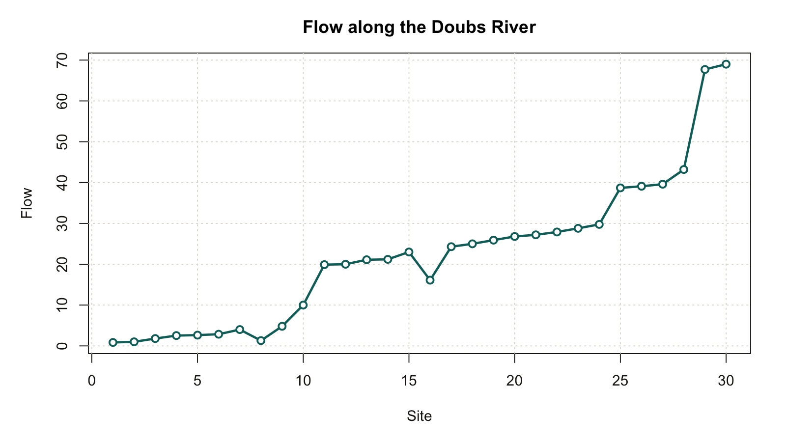
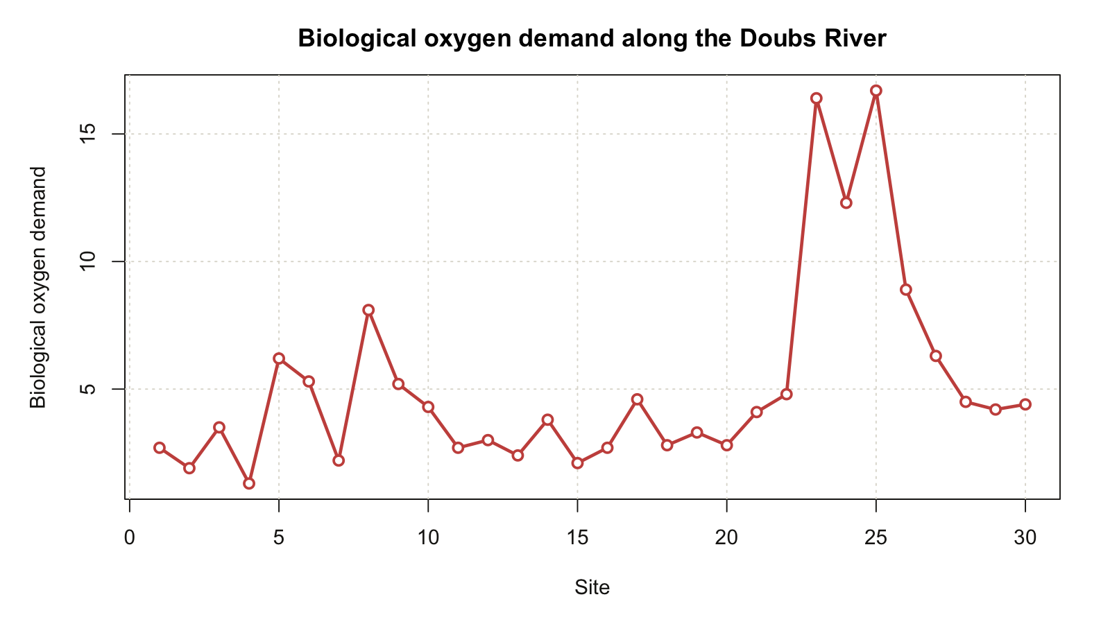
Two suitable graphs to show with this answer are (1) flow against site
number, which displays the broad downstream physical gradient, and (2)
biological oxygen demand against site number, which displays the marked
disturbance at Sites 23--25. An oxygen graph is an acceptable substitute
for the second graph if its inverse response to the disturbance is
explained. The two selected graphs must be included with the Question 4
answer, not merely referred to as graphs made for Task 3.
::: {layout-ncol="2"}
{#fig-lab1-answer-flow}
{#fig-lab1-answer-bod}
:::
### 5. Correlation matrix
**Marking: 1 mark for the complete matrix; 2 marks for two patterns;
2 marks for two mechanistic explanations.**
The correlations below use the 15 odd-numbered sites and are rounded to
two decimal places.
| Variable | `dfs` | `alt` | `slo` | `flo` | `pH` | `har` | `pho` | `nit` | `amm` | `oxy` | `bod` |
|---|---:|---:|---:|---:|---:|---:|---:|---:|---:|---:|---:|
| `dfs` | 1.00 | | | | | | | | | | |
| `alt` | -0.94 | 1.00 | | | | | | | | | |
| `slo` | -0.44 | 0.52 | 1.00 | | | | | | | | |
| `flo` | 0.95 | -0.88 | -0.40 | 1.00 | | | | | | | |
| `pH` | -0.32 | 0.18 | -0.23 | -0.33 | 1.00 | | | | | | |
| `har` | 0.66 | -0.70 | -0.70 | 0.68 | -0.20 | 1.00 | | | | | |
| `pho` | 0.48 | -0.45 | -0.21 | 0.36 | -0.19 | 0.35 | 1.00 | | | | |
| `nit` | 0.72 | -0.73 | -0.33 | 0.58 | -0.30 | 0.47 | 0.87 | 1.00 | | | |
| `amm` | 0.45 | -0.41 | -0.19 | 0.32 | -0.24 | 0.32 | 0.99 | 0.87 | 1.00 | | |
| `oxy` | -0.51 | 0.37 | 0.37 | -0.35 | 0.34 | -0.38 | -0.77 | -0.75 | -0.80 | 1.00 | |
| `bod` | 0.46 | -0.39 | -0.21 | 0.30 | -0.24 | 0.32 | 0.94 | 0.81 | 0.96 | -0.86 | 1.00 |
The strong negative correlation between distance from source and
altitude, and the strong positive correlation between distance and
flow, describe the river's longitudinal physical gradient. Phosphate,
nitrate, ammonium and biological oxygen demand form a strongly
positively correlated water-quality group. Oxygen is strongly
negatively correlated with this group, especially with biological
oxygen demand. A plausible mechanism is that nutrient and organic
inputs stimulate microbial decomposition, increasing oxygen demand and
reducing dissolved oxygen. Some of these correlations also arise because
several variables change together downstream. They therefore do not, on
their own, establish direct causation. pH has relatively weak
correlations with most other variables in this subset.
### 6. Properties of the two matrices
**Marking: 4 marks for distance matrices and 4 marks for correlation
matrices.**
A distance matrix compares **rows**, which here are sites. It is square
and symmetric, has the same sites as its row and column labels, contains
zeros on its diagonal, and has non-negative off-diagonal values. Each
value summarises how far apart two sites are across all included
environmental variables. Standardisation makes the distance unitless
and prevents variables with large numerical scales from dominating.
A large distance identifies strong multivariate environmental
difference, but does not show its direction or identify which variable
caused it.
A correlation matrix compares **columns**, which here are environmental
variables. It is also square and symmetric, but contains ones on its
diagonal and values from -1 to 1 elsewhere. The sign shows the direction
of a linear relationship and the magnitude shows its strength.
Correlation is unchanged by standardisation. It can reveal redundancy
and collinearity among candidate predictors, but it is sensitive to
outliers, can miss nonlinear relationships, and cannot establish
causation. Only one triangle plus the diagonal is needed to represent
either symmetric matrix.
### 7. Reflection on the calculations
**Marking: 2 marks for a clear reflection and practical improvement.**
The work is repetitive because the same operation must be applied to
many pairs, and it is easy to shift a cell range, compare the wrong
sites, omit standardisation or copy a formula with incorrect references.
Its value is that the repetition makes symmetry, diagonal values and
clusters of similar sites visible. The process can be improved by using
clearly labelled worksheets, fixed reference ranges, consistent decimal
precision, conditional formatting and immediate checks of the diagonal
and mirrored cells. Once the logic is understood, suitable statistical
software can automate the calculations, but automation does not remove
the need to choose an appropriate measure and interpret it correctly.
### 8. Connection to macroecology
**Marking: No marks assigned here.**
Macroecology seeks general patterns in the distribution and abundance
of organisms across large spatial, temporal and taxonomic scales. A
sites-by-species table records community composition, while the matched
sites-by-environment table describes the conditions at the same sites.
Environmental distance matrices reduce many environmental variables to
pairwise differences among sites. Correlation matrices identify shared
environmental gradients and warn us when candidate drivers are
redundant. These structures support later analyses of clustering,
ordination, gradient response and distance decay.
The unimodal model supplies a biological interpretation of these
patterns: a species is most abundant near its environmental optimum and
declines as conditions move beyond its tolerance. A coenocline places
the response curves of many species along one gradient; a coenoplane
extends this to two gradients; and a coenospace represents responses to
many interacting gradients. Turnover in community composition should
therefore increase as sites become separated in environmental space.
Observed response curves represent realised niches and can be distorted
by biotic interactions, dispersal, sampling and stochastic variation,
so the matrices describe pattern rather than proving mechanism. Their
macroecological value lies in converting complex multivariate data into
comparable summaries from which general hypotheses can be formulated
and tested across scales.
:::
`r if (params$hide_answers) ":::"`
::: callout-important
## Submission Instructions
The Lab 1 assignment on Ecological Data is due at **08:00 on Monday, 31 August 2026**.
Provide a **neat and thoroughly annotated** MS Excel spreadsheet which
outlines the graphs and all calculations and which displays the
resultant distance matrix. Use separate tabs for the different
questions. Written answers must be typed in an MS Word document. Please
follow the formatting specifications *precisely* shown in the file
[**BDC334 Example essay
format.docx**](resources/BDC334_Example_essay_format.docx) that was
circulated at the beginning of the module. Feel free to use the file as
a template.
Please label the MS Excel and MS Word files as follows:
- `BDC334_<first_name>_<last_name>_Lab_1.xlsx`, and
- `BDC334_<first_name>_<last_name>_Lab_1.docx`
(the `<` and `>` must be omitted as they are used in the example as
field indicators only).
Upload your appropriately named spreadsheet and MS Word documents to
iKamva by the stated deadline. This requirement applies to both pre-assessed
and self-assessed submissions. If this Lab is self-assessed, complete and
upload the self-assessment to iKamva by 23:59 on the same day. See the
[Lab submission and self-assessment policy](BDC334_syllabus.qmd#sec-lab-self-assessment)
for the checking and penalty rules.
Failing to follow these instructions carefully, precisely, and
thoroughly will cause you to lose marks, which could cause a significant
drop in your score as formatting counts for 15% of the final mark (out
of 100%).
:::
<!-- Two samples with similar species composition are ecologically similar, while two samples that share few species are ecologically distant. In Figure 4.1, below, the data displayed in Figure 2.1 have been converted into a dissimilarity distance matrix of dimension $30 \times 27$. The are a few things of interest in this matrix: -->
<!-- * The distance matrix is square and therefore symmetrical. In other words, there are as many rows as there are columns, and this number corresponds to the number of samples in our sites × species matrix. -->
<!-- * The cells of the diagonal running from top-left to bottom-right contain zeros, showing rather obviously that there is no difference between a sample and the sample itself. -->
<!-- * The 'upper triangle' above the diagonal is an inversion of the 'lower triangle' below the diagonal; because they are identical in terms of the pairwise relationships that they encode, distance matrices are sometimes represented simply by the lower triangular matrix. -->
<!-- * These matrices contain ecological information. For example, between samples (here each of 58 × 50-km long coastal sections) that are geographically close together, the dissimilarity will is generally low (i.e. the samples are similar in their species composition), while the further sites are removed from each other, the greater the dissimilarity will be. (*Note: not all samples are not always related to each other as a function of distance — this is a characteristic of the data used for this particular example analysis, so be aware of the context when interpreting distance matrices.*) -->
<!-- * All information about the particular species present within each sample are now gone since that information has been collapsed to a dissimilarity measure. -->
## References
::: {#refs}
:::