---
date: last-modified
title: "4: Ordination"
format:
html: default
---
```{r code-brewing-opts, echo=FALSE}
knitr::opts_chunk$set(
comment = "R>",
warning = FALSE,
message = FALSE,
fig.width = 4.5,
fig.height = 2.625,
out.width = "75%",
fig.asp = NULL, # control via width/height
dpi = 300
)
ggplot2::theme_set(
ggplot2::theme_minimal(base_size = 8)
)
ggplot2::theme_set(
ggplot2::theme_bw(base_size = 8)
)
```
<!-- # Topic 4: Ordination -->
::: callout-tip
## **Material Required for This Chapter**
| Type | Name | Link |
| :--- | :--- | :--- |
| **Slides** | Ordination lecture slides | [💾 `BCB743_07_ordination.pdf`](../slides/BCB743_07_ordination.pdf) |
| **Reading** | Vegan--An Introduction to Ordination | [💾 `Oksanen_intro-vegan.pdf`](../docs/Oksanen_intro-vegan.pdf) |
:::
Ecological data are complex, since I want to know about many species, many environmental factors thought to affect those species, at many places, and at many times. Often I think about these things all at once. Ecologists routinely consider the following data matrices, which serve different purposes, namely *representation* of the data I collect in the field, *comparison* of community structure across space and time, and *explanation* of any patterns seen:
- A spatial context (e.g., a landscape) comprised of many sites (rows), each one characterised by multiple variables (columns), such as species abundances or environmental factors.
- A time series (e.g., repeated sampling) comprised of many samples (rows), each one containing multiple variables (columns), such as species or environmental variables.
- Multidimensional or multivariate data, where the number of dimensions (columns with information about species or environmental variables) approaches the number of samples (sites or times).
Collectively, these matrices are successive abstractions of the ecological reality (in as far as I can measure it), each discarding some information to make other patterns easier to analyse.
In such complex, high-dimensional data, analysing each variable separately using a series of univariate or bivariate analyses would be inefficient (if not impossible) and unlikely to reveal the underlying patterns accurately. In the Doubs River dataset, for instance, a univariate approach would require (27 × 26) / 2 = 351 separate species-pair analyses, which is impractical and prone to misinterpretation.
The count is the smaller problem. Even with unlimited patience for 351 correlations, the pairwise approach would still miss the central structure, namely the pattern that emerges only when all species and sites are considered together. A gradient that orders the whole community, or a group of sites that share a fauna, is a property of the joint configuration, not of any single pair. Ordination recovers that joint structure, so it does more than save time.
Ordination comes from the Latin word *ordinatio*, which means placing things in order [Chapter 9, @legendre2012numerical]. In ecology and some other sciences, it refers to a suite of multivariate statistical techniques used to analyse and visualise complex, high-dimensional data, such as ecological community data. In other words, high-dimensional data are ordered along some 'reduced axes' that explain patterns seen in nature. While [clustering methods](cluster_analysis.qmd) focus on identifying discontinuities or groups within the data, ordination aims to highlight and interpret gradients, which are ubiquitous in ecological communities.
@fig-ordination-preview shows the kind of figure ordination produces, namely a single picture that places all 30 Doubs sites and all 11 environmental variables in one view, with the dominant gradient running from left to right.
```{r code-setup}
#| echo: false
library(tidyverse)
library(vegan)
library(ggrepel)
load(here::here(
"data",
"BCB743",
"NEwR-2ed_code_data",
"NEwR2-Data",
"Doubs.RData"
))
```
```{r fig-ordination-preview}
#| fig-cap: "A PCA ordination of the Doubs River environmental data. Each point is one of the 30 sites, coloured by its position from source (dark) to mouth (yellow). Each red arrow is an environmental variable, pointing in the direction of increasing values. PC1 captures 54.3% of the variation and PC2 a further 19.7%."
#| fig-width: 6
#| fig-height: 4.5
#| code-fold: true
env_pca <- rda(env, scale = TRUE)
ev <- round(100 * eigenvals(env_pca) / sum(eigenvals(env_pca)), 1)

site_sc <- as.data.frame(scores(
  env_pca,
  display = "sites",
  scaling = 2,
  choices = 1:2
))
var_sc <- as.data.frame(scores(
  env_pca,
  display = "species",
  scaling = 2,
  choices = 1:2
))
site_sc$site <- 1:nrow(site_sc)
var_sc$lab <- rownames(var_sc)

# scale the arrows to fit the site cloud
mult <- 0.9 *
  min(
    max(abs(site_sc$PC1)) / max(abs(var_sc$PC1)),
    max(abs(site_sc$PC2)) / max(abs(var_sc$PC2))
  )

ggplot(site_sc, aes(PC1, PC2)) +
  geom_hline(yintercept = 0, colour = "grey85") +
  geom_vline(xintercept = 0, colour = "grey85") +
  geom_point(aes(colour = site), size = 2) +
  scale_colour_viridis_c(name = "Site\n(source to mouth)") +
  geom_segment(
    data = var_sc,
    aes(x = 0, y = 0, xend = PC1 * mult, yend = PC2 * mult),
    arrow = arrow(length = unit(2, "mm")),
    colour = "firebrick",
    linewidth = 0.4
  ) +
  geom_text_repel(
    data = var_sc,
    aes(x = PC1 * mult, y = PC2 * mult, label = lab),
    colour = "firebrick",
    size = 2.7,
    segment.colour = "grey70",
    min.segment.length = 0,
    max.overlaps = Inf
  ) +
  labs(x = paste0("PC1 (", ev[1], "%)"), y = paste0("PC2 (", ev[2], "%)")) +
  coord_equal()
```
::: {.callout-note appearance="simple"}
## How to Read This Figure (for now)
- Each **point** is a site; sites close together have similar environments.
- Colour runs from the **source** (dark) to the **mouth** (yellow), so the left-to-right spread is the river gradient.
- Each **arrow** is an environmental variable, pointing towards higher values.
- Arrows pointing the same way (`pho`, `amm`, `bod`) are correlated; arrows pointing opposite ways (`oxy` against the nutrients) are negatively correlated.
The rest of the chapter earns the right to interpret every element of this figure. For now, the point is that ordination turns a 30 × 11 table into one interpretable picture.
:::
The multivariate data about environmental properties or species composition, which I present to the analyses as tables of species or environmental variables, can be prepared in different ways. The most common workflows involve the following steps (@fig-data-tables):
- **Species data**: A table where each row represents a site or sample, and each column represents a species. The values in the table are species abundances, presences, or other species-related data.
- **Environmental data**: A table where each row represents a site or sample, and each column represents an environmental variable. The values in the table are environmental measurements, such as temperature, pH, or nutrient concentrations.
From here, I can derive the following types of matrices:
- **Species × species association matrix**: A matrix that quantifies the similarity or dissimilarity between species based on their co-occurrence patterns across sites.
- **Site × site matrix of species dissimilarities**: A matrix that quantifies the ecological differences between sites based on the species composition.
- **Site × variable table of standardised environmental data**: A table with standardised environmental conditions at each site.
- **Site × site matrix of environmental distances**: A matrix that quantifies the environmental differences between sites based on the environmental variables.
- **Variable × variable correlation matrix**: A matrix that quantifies the relationships between environmental variables.
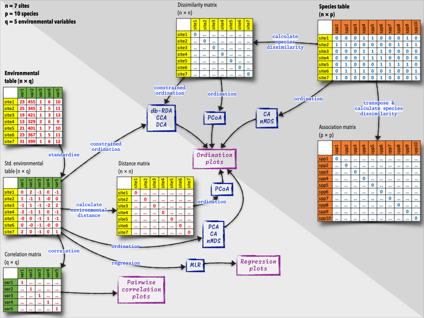{#fig-data-tables}
Some of these newly-calculated matrices are then used as starting points for the ordination analyses.
The following methods are covered in the lecture slides. You are expected to be familiar with how to select the appropriate method, and how to execute each. Supplement your studying by accessing Numerical Ecology with R, GUSTA ME (see links immediately below), and Analysis of Community Ecology Data in R:
- [Principal Component Analysis (PCA)](https://www.davidzeleny.net/anadat-r/doku.php/en:pca)
- [Correspondence Analysis (CA)](https://www.davidzeleny.net/anadat-r/doku.php/en:ca_dca)
- [Detrended Correspondence Analysis (DCA)](https://www.davidzeleny.net/anadat-r/doku.php/en:ca_dca)
- [Principal Coordinate Analysis (PCoA)](https://www.davidzeleny.net/anadat-r/doku.php/en:pcoa_nmds)
- [non-Metric Multidimensional Scaling (nMDS)](https://www.davidzeleny.net/anadat-r/doku.php/en:pcoa_nmds)
- [Redundancy Analysis (RDA)](https://www.davidzeleny.net/anadat-r/doku.php/en:rda_cca)
- [Canonical Correspondence Analysis (CCA)](https://www.davidzeleny.net/anadat-r/doku.php/en:rda_cca)
- [Distance-based Redundancy Analysis (db-RDA)](https://www.davidzeleny.net/anadat-r/doku.php/en:rda_cca)
## Dimension Reduction
Ordination is a dimension reduction method. It:
- Takes high-dimensional data (many columns).
- Applies scaling and rotation.
- Reduces the complexity to a low-dimensional space (orthogonal axes).
Ordination represents the complex data along a reduced number of orthogonal axes (linearly independent and uncorrelated), constructed so that they capture the main trends or gradients in the data in decreasing order of importance. Each orthogonal axis captures a portion of the variation attributed to the original variables (columns). Interpretation of these axes is aided by visualisations (biplots), regressions, and clustering techniques.
Ordination geometrically arranges (projects) sites or species into a simplified dataset, where distances between them in the Cartesian 2D or 3D space represent their ecological or species dissimilarities. In this simplified representation, the further apart the shapes representing sites or species are on the graph, the larger the ecological differences between them.
::: {.callout-tip}
## Analogy of What an Ordination Does
Picture a three-dimensional pear lit by a directed beam, casting a shadow on a wall. Rotate the pear and the shadow shifts from a recognisable pear outline to an uninformative disc, and some orientations preserve far more of its shape than others. Ordination does the same with data. It rotates a high-dimensional cloud of points, where each variable is an axis and each site a point, and projects that cloud onto a few axes, choosing the orientation that keeps as much of the structure as possible. The first axis is the rotation that casts the most informative shadow, and each later axis captures what remains, at right angles to those before it.
:::
The reduced axes are ordered by the amount of variation they capture, with the first axis capturing the most variation, the second axis capturing the second most, and so on. The axes are orthogonal, so they are uncorrelated. They are linear combinations of the original variables, making them interpretable.
“Ordination primarily endeavours to represent sample and species relationships as faithfully as possible in a low-dimensional space” (Gauch, 1982). This is necessary because visualising multiple dimensions (species or variables) simultaneously in community data is challenging, if not impossible. Ordination compromises between the number of dimensions and the amount of information retained. Ecologists are frequently confronted by 10s, if not 100s, of variables, species, and samples. A single multivariate analysis also saves time compared to conducting separate univariate analyses for each species or variable. What I really want is for the dimensions of this 'low-dimensional space' to represent important and interpretable environmental gradients.
### A Small Worked Example
Dimension reduction is easiest to grasp on a dataset small enough to read by eye. Consider five sites and three environmental variables:
| Site | Temperature | Nutrients | Oxygen |
| :--- | :---: | :---: | :---: |
| A | 25 | 9 | 4 |
| B | 22 | 7 | 6 |
| C | 18 | 5 | 8 |
| D | 15 | 3 | 10 |
| E | 12 | 1 | 12 |
The three variables are not independent. Temperature and nutrients rise together, and both fall as oxygen rises, so a warm, nutrient-rich site is oxygen-poor and the reverse. The three columns tell one shared story three times.
A PCA recognises this redundancy and replaces the three variables with a single dominant axis (@fig-pca-toy). That one axis accounts for 99.9% of the variation, ordering the sites from A to E along one gradient. The other two axes have been set aside with almost no loss, since they repeated what the first already said.
```{r fig-pca-toy}
#| fig-cap: "The five toy sites projected onto the first PCA axis. A single gradient (PC1) carries 99.9% of the variation in the three original variables, ordering the sites from A (warm, nutrient-rich, oxygen-poor) to E (cool, nutrient-poor, oxygen-rich)."
#| fig-width: 5.5
#| fig-height: 1.9
#| code-fold: true
toy <- data.frame(
  Temperature = c(25, 22, 18, 15, 12),
  Nutrients = c(9, 7, 5, 3, 1),
  Oxygen = c(4, 6, 8, 10, 12),
  row.names = c("A", "B", "C", "D", "E")
)

toy_pca <- rda(toy, scale = TRUE)
tev <- round(100 * eigenvals(toy_pca) / sum(eigenvals(toy_pca)), 1)
ts <- as.data.frame(scores(
  toy_pca,
  display = "sites",
  scaling = 1,
  choices = 1:2
))
ts$site <- rownames(ts)

ggplot(ts, aes(PC1, 0)) +
  geom_hline(yintercept = 0, colour = "grey60") +
  geom_point(size = 3, colour = "steelblue") +
  geom_text(aes(label = site), vjust = -1.2, size = 3.5) +
  scale_y_continuous(limits = c(-0.6, 0.6), breaks = NULL, name = NULL) +
  labs(x = paste0("PC1 (", tev[1], "% of variance)")) +
  theme(panel.grid = element_blank())
```
This is what ordination does on the full Doubs dataset, only with 11 variables rather than three, and with the redundancy spread across several axes rather than collapsed onto one.
## Benefits of Ordination
Ecological communities are structured assemblages shaped by shared environmental constraints, biotic interactions, and historical contingencies. Analysing species one at a time therefore fragments a system whose organisation is inherently multivariate. Ordination treats the community (not a population) as the primary unit of analysis and allows patterns of co-occurrence and turnover among species to be examined directly. So, it provides a natural framework for studying β diversity (the variation in species composition among sites) without reducing that variation to a sequence of disconnected pairwise comparisons involving multiple populations.
Ordination exploits the redundancy in multivariate data rather than treating it as a nuisance. Ecological datasets contain variables that covary because they respond to the same underlying gradients. Conducting many separate univariate tests on such data (which univariate statistics warns against) inflates the probability of false positives and hides the shared structure that gives rise to those correlations. Ordination collapses this correlated variation into a smaller number of combined axes, each representing a dominant dimension of variation. This reduction concentrates signal while relegating minor, incoherent variation to higher axes that are not interpreted. This makes ordination a principled form of noise reduction grounded in the geometry (rotation) of the data.
Ordination ranks dimensions by the amount of variation they account for, so gradients can be compared in terms of their relative strength. This ordering supports statements about dominance and secondary structure (whether one gradient outweighs another, or whether meaningful structure persists beyond the first few axes), which is nearly impossible to accomplish with univariate methods alone.
Ordination also translates numerical relationships into spatial configurations that are easily presented as visualisations. Ordination diagrams compress the high-dimensional relationships into intuitive graphs that make similarities, differences, and alignments obvious. This graphical representation plays a central role in interpretation, hypothesis development, and communication. Patterns that are opaque in tables of coefficients or test statistics often become intelligible once expressed as distances, directions, and relative positions in ordination space.
## Types of Ordinations
The most useful way to organise the methods is by their purpose, namely the question each one answers. **Unconstrained** methods are exploratory. They take a single table (species or environmental) and ask what its dominant patterns are. **Constrained** methods are hypothesis-driven. They bring in a second table of explanatory variables and ask how much of the pattern that table accounts for. The distinction is whether environmental data shape the axes (constrained) or are mapped onto them afterwards (unconstrained).
The methods reduce dimensions in one of two ways. Most solve for their axes in a single step through matrix decomposition, an approach known as **eigen-analysis**, while non-Metric Multidimensional Scaling is the exception, finding its axes by iterative numerical optimisation. The method of eigenvalues and eigenvectors is covered in the [PCA chapter](PCA.qmd), where it does real work. At this stage it is enough to know that some methods compute their axes directly and one searches for them by trial and improvement.
### Unconstrained ordination (indirect gradient analysis)
Although unconstrained ordinations are grounded in statistical models and assumptions (e.g. Euclidean geometry, χ² distances, linearity vs. unimodality), they do not natively apply inference testing, so their default application makes them more descriptive than inferential. Sometimes they are called indirect gradient analysis. These analyses are based on either the environment × sites matrix or the species × sites matrix, each analysed and interpreted in isolation. The main goal is to find the main gradients in the data. I apply indirect gradient analysis when the gradients are unknown *a priori* and I do not have environmental data related to the species. Gradients or other influences that structure species in space are therefore inferred from the species composition data only. The communities thus reveal the presence (or absence) of gradients, but may not offer insight into the identity of the structuring gradients. The most common methods are:
- **[Principal Component Analysis (PCA)](PCA.qmd):** The main eigenvector-based method, working on raw, quantitative data. It preserves the Euclidean (linear) distances among sites, mainly used for environmental data but also for species abundance data after an appropriate transformation (e.g. Hellinger).
- **[Correspondence Analysis (CA)](CA.qmd):** Works on data that must be frequencies or frequency-like, dimensionally homogeneous, and non-negative. It preserves the $\chi^2$ distances among rows or columns, mainly used in ecology to analyse species data tables.
- **[Detrended Correspondence Analysis (DCA)](DCA.qmd):** A variant of CA for species data tables with long environmental gradients. Ordinary CA on such data produces a spurious curvature in the ordination diagram, the *arch effect*; DCA removes it by detrending. Detrending does not change the unimodal species responses; it breaks the second axis into segments, re-centres them, and rescales the axes into units of compositional turnover (standard deviations).
- **[Principal Coordinate Analysis (PCoA)](PCoA.qmd):** Devoted to the ordination of dissimilarity or distance matrices, often in the Q mode instead of site-by-variables tables, offering great flexibility in the choice of association measures.
- **[non-Metric Multidimensional Scaling (nMDS)](nMDS.qmd):** A non-eigen-analysis method that works on a dissimilarity or distance matrix, preserving the rank order of the dissimilarities rather than their magnitudes, to study the relationship between sites or species. nMDS represents objects along a predetermined number of axes while preserving the ordering relationships among them.
Unconstrained ordinations are often used in hypothesis-adjacent ways (e.g., axis interpretation guided by prior ecological expectations), and I turn to the constrained versions as needed for more hypothesis-driven insights.
### Constrained ordination (direct gradient analysis)
[Constrained ordination](constrained_ordination.qmd) adds a level of statistical testing and is also called direct gradient analysis or canonical ordination. It typically uses explanatory variables (in the environmental matrix) to explain the patterns seen in the species matrix. The main goal is to find the main gradients in the data and test the significance of these gradients. So, I use constrained ordination when important gradients are hypothesised. Likely evidence for the existence of gradients is measured and captured in a complementary environmental dataset that has the same spatial structure (rows) as the species dataset. Direct gradient analysis is performed using linear or non-linear regression methods that relate the ordination performed on the species to its matching environmental variables. The most common methods are:
- **Redundancy Analysis (RDA)**: A constrained form of PCA, where ordination is constrained by environmental variables, used to study the relationship between species and environmental variables.
- **Canonical Correspondence Analysis (CCA)**: A constrained form of CA, where ordination is constrained by environmental variables, used to study the relationship between species and environmental variables.
- **Detrended Canonical Correspondence Analysis (DCCA)**: A constrained form of CA, used to study the relationship between species and environmental variables.
- **[Distance-Based Redundancy Analysis (db-RDA)](constrained_ordination.qmd):** A constrained form of PCoA, where ordination is constrained by environmental variables, used to study the relationship between species and environmental variables.
PCoA and nMDS can produce ordinations from any square [dissimilarity or distance matrix](dis-metrics.qmd), offering more flexibility than PCA and CA, which require site-by-species tables. PCoA and nMDS are also less sensitive to outliers and missing data than PCA and CA.
## Which Ordination Should I Use?
The methods differ in the data they take, the kind of distance they preserve, and the question they suit. The table sets them side by side:
| Method | Class | Input data | Distance preserved | Typical use |
| :--- | :--- | :--- | :--- | :--- |
| PCA | unconstrained | site × variable table | Euclidean (linear) | environmental gradients |
| CA | unconstrained | site × species counts | $\chi^2$ | species composition, short gradients |
| DCA | unconstrained | site × species counts | $\chi^2$, detrended | species composition, long gradients |
| PCoA | unconstrained | any distance matrix | user-chosen | flexible ecological distances |
| nMDS | unconstrained | any distance matrix | rank order | complex communities, less sensitive to outliers |
| RDA | constrained | species + environment | Euclidean (linear) | linear species–environment hypotheses |
| CCA | constrained | species + environment | $\chi^2$ | unimodal species–environment hypotheses |
| db-RDA | constrained | distance matrix + environment | user-chosen | hypotheses on any chosen distance |
The same choices can be followed as a sequence of questions (@fig-ordination-decision): first the goal (explore or test), then the data, then the length of the gradient.
```{mermaid}
%%| label: fig-ordination-decision
%%| echo: false
%%| fig-cap: "A decision aid for choosing an ordination method, organised first by goal and then by the data in hand."
flowchart TD
  A["What is the goal?"] --> B["Explore patterns<br/>(unconstrained)"]
  A --> C["Test environmental<br/>hypotheses (constrained)"]
  B --> D{"Input data?"}
  D -->|Environmental variables| E["PCA"]
  D -->|Species composition| F{"Gradient length?"}
  D -->|Any distance matrix| G["PCoA or nMDS"]
  F -->|Short| H["CA"]
  F -->|Long| I["DCA"]
  C --> J{"Underlying response?"}
  J -->|Linear / Euclidean| K["RDA"]
  J -->|Unimodal species turnover| L["CCA"]
  J -->|Any distance matrix| M["db-RDA"]
```
## Ordination Diagrams
Ordination diagrams are convenient visual summaries that capture the geometric representations of relationships in high-dimensional space. Distances, directions, and relative positions (of sites and species) in the diagram correspond to patterns in the original multivariate ecological data, compressed into a form that can be visually inspected and interpreted.
Ordination analyses are typically presented through graphical representations called ordination diagrams, which provide a simplified visual summary of the relationships between samples (the rows), species (columns), and environmental variables (also columns) in multivariate ecological data.
### Reading a Biplot
I opened with an ordination diagram (@fig-ordination-preview) and postponed its full interpretation. The ideas above now make that interpretation possible. The diagram is a **biplot**, namely it shows two things at once, sites as points and variables as arrows.
1. **Sites (points).** Each point is a site. Points near one another mark sites with similar environments; points far apart mark sites that differ.
2. **Axes.** PC1 (horizontal) is the dominant gradient and carries the most variation (54.3%); PC2 (vertical) adds the next most (19.7%). Here PC1 is the source-to-mouth gradient, recovered without telling the analysis where any site sits on the river.
3. **Arrows (variables).** Each arrow points towards increasing values of its variable. A site's value for that variable is found by projecting its point onto the arrow's line.
4. **Arrow length.** Longer arrows mark variables more strongly correlated with the displayed axes (`ele`, `oxy`, and the nutrients), while a short arrow (`pH`) is weakly represented in this plane.
5. **Angles between arrows.** A small angle marks a positive correlation (`pho`, `amm`, and `bod` group together); an angle near 180° marks a negative correlation (`oxy` opposes the nutrients); a right angle marks near-independence. This is the collinearity already visible in the [correlation matrix](correlations.qmd), now seen geometrically.
### Species as Points: a Correspondence Analysis
Linear methods such as PCA draw variables as arrows, which suits environmental data. For species composition, Correspondence Analysis (CA) is usually more appropriate, and it draws species as **points** rather than arrows, each point marking where that species is most abundant along the axes (@fig-ca-doubs).
```{r fig-ca-doubs}
#| fig-cap: "A CA ordination of the Doubs River fish data. Grey points are sites; green crosses are species, labelled where they sit away from the crowded centre. The first axis (CA1) is again the upstream-to-downstream gradient. The gentle curve in the site points is the arch effect."
#| fig-width: 5.8
#| fig-height: 4.2
#| code-fold: true
spe_nonzero <- spe[rowSums(spe) > 0, ] # drop the one fishless site
spe_ca <- cca(spe_nonzero)
cev <- round(100 * eigenvals(spe_ca) / sum(eigenvals(spe_ca)), 1)

ca_sites <- as.data.frame(scores(spe_ca, display = "sites", choices = 1:2))
ca_spp <- as.data.frame(scores(spe_ca, display = "species", choices = 1:2))
ca_spp$lab <- rownames(ca_spp)
ca_spp$d <- sqrt(ca_spp$CA1^2 + ca_spp$CA2^2)
ca_lab <- ca_spp[ca_spp$d > quantile(ca_spp$d, 0.5), ] # label outer species only

ggplot() +
  geom_hline(yintercept = 0, colour = "grey85") +
  geom_vline(xintercept = 0, colour = "grey85") +
  geom_point(data = ca_sites, aes(CA1, CA2), colour = "grey45", size = 1.6) +
  geom_point(
    data = ca_spp,
    aes(CA1, CA2),
    colour = "seagreen4",
    size = 0.8,
    shape = 3
  ) +
  geom_text_repel(
    data = ca_lab,
    aes(CA1, CA2, label = lab),
    colour = "seagreen4",
    size = 2.4,
    max.overlaps = Inf,
    segment.colour = "grey80"
  ) +
  labs(x = paste0("CA1 (", cev[1], "%)"), y = paste0("CA2 (", cev[2], "%)")) +
  coord_equal()
```
In @fig-ca-doubs the sites again spread along a dominant first axis, the upstream-to-downstream gradient, with cool-water species (`Satr`, `Phph`, `Thth`, `Cogo`) at one end and lowland species (`Abbr`, `Blbj`, `Gyce`) at the other. The curve in the site points is the *arch effect*, an artefact of long gradients that motivates Detrended Correspondence Analysis (DCA). The two diagrams answer different questions. The PCA biplot shows how environmental variables covary, while the CA shows which species share sites.
### Basic elements of ordination diagrams
- Sample Representation:
- Individual samples or plots (rows) are displayed as points or symbols.
- The relative positions of these points reflect the similarity (points plotting closer together) or dissimilarity (points spread further apart) between samples based on their species composition.
- Species Representation:
- In linear methods (e.g., PCA, RDA): Species are represented by arrows, with direction indicating increasing abundance and length suggesting rate of change.
- In weighted averaging methods (e.g., CA, CCA): Species are shown as points, representing their optimal position (often suggesting a unimodal distribution).
- Environmental Variable Representation:
- Quantitative Variables: Displayed as vectors, with the arrows' direction showing the gradient of increasing values and length indicating correlation strength with ordination axes.
- Qualitative Variables: Represented by centroids (average positions) for each category.
- Default plot options use base R graphics, but more advanced visualisations can be created using **ggplot2**.
### Construction of the ordination space
- The coordinates given by the eigenvectors (species and site scores) are displayed on a 2D plane, typically using PC1 and PC2 (or PC1 and PC3, etc.) as axes.
- This creates a biplot, simultaneously plotting sites as points and environmental variables as vectors.
- The loadings (coefficients of original variables) define the reduced-space 'landscape' across which sites are scattered.
- Different scaling options (e.g., site scaling vs. species scaling) can emphasise different aspects of the data.
### Interpretation of the diagram
- Sample Relationships:
- Proximity between sample points indicates similarity in species composition.
- The spread of sites along environmental arrows represents their position along that gradient.
- Species-Environment Relationships:
- The angle between species arrows or their distance from sample points reflects association or abundance patterns.
- The arrangement of sites in the reduced ordination space represents their relative positions in the original multidimensional space.
- Environmental Gradients:
- Arrow length indicates the strength of the relationship between the variable and the principal component.
- The cosine of the angle between arrows represents the correlation between environmental variables.
- Parallel arrows suggest positive correlation, opposite arrows indicate negative correlation, and perpendicular arrows suggest uncorrelated variables.
- Biplots are heuristic tools and patterns should be further tested for statistical significance if necessary.
- Outliers can greatly influence the ordination and should be carefully examined.
## Summary
The chapter has introduced a vocabulary that recurs throughout the rest of the course. The table gathers it in one place:
| Concept | In one line |
| :--- | :--- |
| Ordination | reduce dimensions while keeping as much structure as possible |
| Axis | a composite gradient built from many original variables |
| Eigenvalue | the amount of variation an axis captures |
| Eigenvector | the direction of an axis in the space of original variables |
| Unconstrained | explore the dominant patterns in a single table |
| Constrained | test how much a second, environmental table explains |
| Biplot | sites and variables shown together in the reduced space |
@fig-ordination-preview shows what ordination produces, namely a high-dimensional table turned into one readable picture, and @fig-data-tables shows where ordination sits in the wider workflow of species tables, environmental tables, correlations, associations, and distances. The chapters that follow take each method in turn, starting with [PCA](PCA.qmd).
## References
::: {#refs}
:::


